본 포스팅에서는 html, css, javascript를 이용하여 둥근 toggle버튼을 만들고, 버튼의 상태가 변경될 때마다 상태를 출력하는 기능까지 만들어 봅니다. 본 보스팅에 사용되는 기본코드는 w3schools에서 가지고 온 것입니다. w3schools에서는 단순히 css를 이용해서 토글버튼처럼 보이는 것을 만드는 것 까지만 보여주었는데, 저는 그렇게 토글이 될 때마다 자바스크립트를 이용해서 어떤 기능이 실행되는 부분까지 확장해서 포스팅합니다.
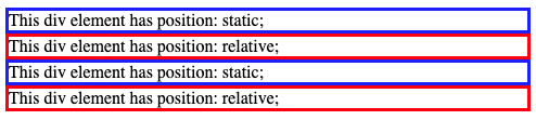
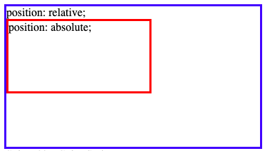
자, 코드를 보면 static 클래스와 relative 클래스 모두 동일한 속성을 갖고있는 것을 알 수 있죠. top, right, bottom, left의 값은 둘 다 없습니다. 이 경우 relative와 static은 아무런 차이가 없습니다. 그저, 태그 순서대로 화면에 출력되죠.
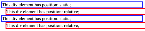
relative 클래스에 속한 div 엘리먼트들이 아래쪽으로 15px만큼 내려온 것을 확인할 수 있습니다.
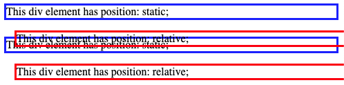
이제 top속성의 값을 100px로 세팅해보세요. relative 클래스의 div 엘리먼트들이 아래쪽으로 한참 내려가는 것을 확인할 수 있습니다. 여기서 중요한 점은, relative 클래스의 엘리먼트들이 아래로 내려갔다고 해서 static 클래스의 엘리먼트들이 위쪽으로 이동하거나 하지는 않는 다는 것입니다.
3. fixed
fixed 속성은 화면에 보이는 위치가 기준이라고 생각하시면 됩니다.
한번 위치가 결정되면 화면에서 스크롤이 생긴다해도 사라지지 않고 처음 화면에 출력되었던 그자리에 고정적으로 위치합니다.
그래서 속성 이름이 fixed 인겁니다.
이 속성의 경우 relative처럼 top, right, bottom, left 속성으로 위치값을 지정해줄 수 있지만,
relative 속성과는 달리 원래 있어야 할 위치, 즉, static일 경우에 위치할 곳에 빈공간을 만들지 않습니다.
여기서 빈공간을 만든다는 것은 다른 엘리먼트가 그 자리에 위치할 수 없도록 한다는 말과 같습니다.
이 속성은 말 그대로 화면을 기준으로 어찌보면 절대적인 위치를 설정하는 것이므로 아마 가장 쉽게 이해할 수 있는 속성이라 생각합니다. 따라서 예제는 생략합니다.
4. absolute
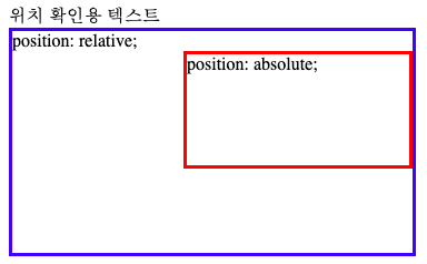
이 속성은 가장 가까운 positioned 조상 엘리먼트에 상대적인 위치를 설정할 수 있도록 해줍니다.
fixed 속성이 화면에서 상대적인 위치를 결정할 수 있도록 해주는 속성이라면,
absolute는 positioned 조상 엘리먼트에서 상대적인 위치를 결정한다는 점에서 차이가 있습니다.
만약, 가장 가까운 positioned 조상 엘리먼트 가 없다면 body를 기준으로 하며 위치값에 따라 스크롤이 생기기도 합니다.
여기서, positioned 엘리먼트라는 것은 position 속성 값이 static인 것을 제외하고 position 속성을 갖고있는 엘리먼트를 의미합니다.
이 속성은 쇼핑몰 같은 곳에서 사진 위에 왼쪽, 오른쪽 화살표를 오버랩 시키고 해당 화살표를 클릭할 때마다 사진을 바꿔주는 기능을 추가할 때 많이 사용하는 것 같습니다.
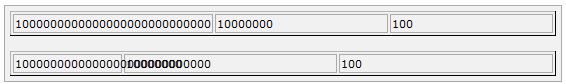
You will notice the benefits more on large tables. The reason this
makes tables load faster is because with traditional HTML, the browser
had to calculate every cell before finally rendering the table. When you
set the table-layout algorithm to fixed however, it only needs
to look at the first row before rendering the whole table. This means
that your table will need to have fixed column widths and row heights.
This will be used to make any particular color transparent and
usually it is used with images. You can use it with scrollbars
also.Following are the parameters which can be used in this filter:
This will be used to create a shadow of your object at the specified X (horizontal) and Y (vertical) offset and color.
. Following are the parameters which can be used in this filter:
Parameter
Description
color
The color, in #RRGGBB format, of the dropshadow.
offX
Number of pixels the drop shadow is offset from
the visual object, along the x-axis. Positive integers move the drop
shadow to the right, negative integers move the drop shadow to the left.
offY
Number of pixels the drop shadow is offset from
the visual object, along the y-axis. Positive integers move the drop
shadow down, negative integers move the drop shadow up.
positive
If true, all opaque pixels of the object have a
dropshadow. If false, all transparent pixels have a dropshadow. The
default is true.
This will be used to create a glow around the object. If it is a
transparent image then glow is created around the opaque pixels of it.
Following are the parameters which can be used in this filter:
This will be used to map the colors of the object to their opposite
value in the color spectrum ie. to create a negative image. Following
are the parameters which can be used in this filter:
Parameter
Description
Invert
Maps the colors of the object to their opposite value in the color spectrum.
This will be used to turn transparent pixels to a specified color and
makes opaque pixels transparent. Following are the parameters which can
be used in this filter:
This will be used to create an attenuated shadow in the direction and
color specified. This is a filter lies in between Dropshadow and a
Glow. Following are the parameters which can be used in this filter:
Parameter
Description
color
The color that you want the shadow to be.
direction
The direction of the blur, going clockwise, rounded to 45-degree increments. The default value is 270 (left).
0 = Top
45 = Top right
90 = Right
135 = Bottom right
180 = Bottom
225 = Bottom left
270 = Left
315 = Top left
CSS가 브라우저에 적용될 때 순서대로 적용이 되도록 되어있습니다. 따라서 앞에서 정의했던 것이 적용이 된 뒤에 마지막에 정의한 것이 적용이 되는데 이때 동일한 요소에 대해서 다른 값을 정의해버리면 마지막에 정의한 값이 적용되고 앞에서 정의한 값은 적용이 되지 않습니다.
만약 어떤 속성이 정말 중요해서 이건 실수로 오버라이드 되면 안된다 싶을때 사용하는것이 바로 이 !important 규칙입니다.
이 규칙을 적용한 스타일은 문서의 어느곳에나 있어도 적용이 됩니다.
다음 예제를 한번 보시죠.
<style tyle="text/css">
<!--
p { color: #ff0000; }
p { color: #000000; }
-->
</style>
동일한 요소에 서로다른 색상을 적용시키는 스타일이 선언되어있습니다. 앞에꺼는 빨간색, 뒤에꺼는 검은색이죠. 그러면 후자인 검정색만 적용이 됩니다. 이때 빨간색 속성이 중요한 속성이다라고 아래처럼 선언을 해주시면....
<style tyle="text/css">
<!--
p { color: #ff0000 !important; }
p { color: #000000; }
-->
</style>
Use this element to add special styles to the first line of the text in a selector.
:first-letter
Use this element to add special style to the first letter of the text in a selector.
:before
Use this element to insert some content before an element.
:after
Use this element to insert some content after an element.
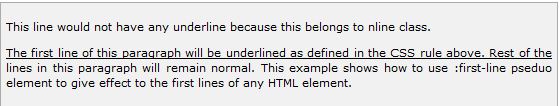
The :first-line pseudo-element
Following is the example which demonstrates how to use :first-line element to add special effect to the first line of elements in the document .
<style type="text/css">
p:first-line { text-decoration: underline; }
p.noline:first-line { text-decoration: none; }
</style>
<p class="noline"> This line would not have any underline
because this belongs to nline class.</p>

<p>The first line of this paragraph will be underlined
as defined in the CSS rule above. Rest of the lines in this
paragraph will remain normal. This example shows how to use
:first-line pseduo element to give effect to the first line
of any HTML element.</p>
결과는 아래와 같습니다.
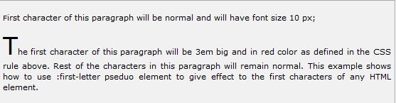
The :first-letter pseudo-element
Following is the example which demonstrates how to use :first-letter element to add special effect to the first letter of elements in the document .
<style type="text/css">
p:first-letter { font-size: 3em; text-color:red; }
p.normal:first-letter { font-size: 10px; }
</style>
<p class="normal"> First character of this paragraph will
be normal and will have font size 10 px;</p>

<p>The first character of this paragraph will be 3em big
and in red color as defined in the CSS rule above. Rest of the
characters in this paragraph will remain normal. This example
shows how to use :first-letter pseduo element to give effect to
the first characters  of any HTML element.</p>
결과는 아래와 같습니다.
The :before pseudo-element
Following is the example which demonstrates how to use :before element to add some content before any element .
<style type="text/css">
p:before
{
content: url(/images/bullet.gif)
}
</style>
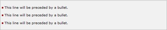
<p> This line will be preceded by a bullet.</p>
<p> This line will be preceded by a bullet.</p>
<p> This line will be preceded by a bullet.</p>
결과는 아래와 같습니다.
The :after pseudo-element
Following is the example which demonstrates how to use :after element to add some content after any element .
<style type="text/css">
p:after
{
content: url(/images/bullet.gif)
}
</style>
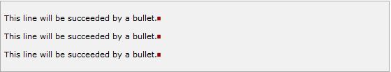
<p> This line will be succeeded by a bullet.</p>
<p> This line will be succeeded by a bullet.</p>
<p> This line will be succeeded by a bullet.</p>
상대 위치 설정에서 사용되는 하위 속성으로는 top, bottom, left와 right가 있습니다.
top과 left의 속성값이 마이너스 (- ) 숫자를 사용함으로서 bottom과 right를 표현할 수 있습니다.
Move Left - Use a negative value for left.
Move Right - Use a positive value for left.
Move Up - Use a negative value for top.
Move Down - Use a positive value for top.
NOTE: You can use bottom or right values as well in the same way as top and left.
다음 예제를 보시죠.
<div style="position:relative;left:80px;top:2px;
            background-color:yellow;">
This div has relative positioning.
</div>
This will produce following result:
This div has relative positioning.
Absolute Positioning:
절대 포지셔닝은 특정 위치에 항상 위치할 수 있도록 고정시키는 것이죠.
상대 포지셔닝처럼 top, left, bottom, right 모두 사용가능합니다. 사용방법도 동일하죠.
Move Left - Use a negative value for left.
Move Right - Use a positive value for left.
Move Up - Use a negative value for top.
Move Down - Use a positive value for top.
NOTE: You can use bottom or right values as well in the same way as top and left.
다음 예제를 보시죠.
<div style="position:absolute;left:80px;top:20px;
            background-color:yellow;">
This div has absolute positioning.
</div>
결과는 직접 테스트해보시고 보도록 하세요. ^_^
Fixed Positioning:
고정 포지셔닝은 자칫 잘못 이해하면 절대 포지셔닝과 동일하다고 생각하실 수 있는데 이 고정 포지셔닝은 상대 + 절대 포지셔닝이라고 생각하시면 됩니다. 고정 포지셔닝은 눈으로 보여지는 화면의 특정 위치에 고정시키는 것입니다. 스크롤링이 있더라도 무조건 화면의 특정위치에 보이도록 하는 속성이죠.
역시 상대, 절대 포지셔닝처럼 top, left, bottom, right 속성을 사용할 수 있으며 사용방법도 동일합니다.
Move Left - Use a negative value for left.
Move Right - Use a positive value for left.
Move Up - Use a negative value for top.
Move Down - Use a positive value for top.
NOTE: You can use bottom or right values as well in the same way as top and left.
다음 예제를 보시죠.
<div style="position:fixed;left:80px;top:20px;
            background-color:yellow;">
This div has fixed positioning.
</div>
이번 포스팅에서는 CSS를 이용해서 스크롤바를 설정하는 방법에 대해서 알아보도록 하겠습니다.
CSS 속성 중에 overflow 라는 속성이 있는데 이녀석은 컨텐트 박스보다 많은 양의 컨텐트가 들어갈 경우에 컨텐트가 어떻게 보여져야 하는지에 대해서 설정해주는 속성입니다.
이 속성에 대한 속성값은 다음과 같은 값들이 있습니다.
Value
Description
visible
Allows the content to overflow the borders of its containing element.
hidden
The content of the nested element is simply cut off at the border of the containing element and no scrollbars is visible.
scroll
The size of the containing element does not change, but the scrollbars are added to allow the user to scroll to see the content.
auto
The purpose is the same as scroll, but the scrollbar will be shown only if the content does overflow.
다음 예제를 보실까요.
<style type="text/css">
.scroll{
display:block;
border: 1px solid red;
padding:5px;
margin-top:5px;
width:300px;
height:50px;
overflow:scroll;
}
.auto{
display:block;
border: 1px solid red;
padding:5px;
margin-top:5px;
width:300px;
height:50px;
overflow:auto;
}
</style>
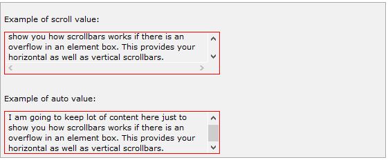
<p>Example of scroll value:</p>
<div class="scroll">
I am going to keep lot of content here just to show
you how scrollbars works if there is an overflow in
an element box. This provides your horizontal as well
as vertical scrollbars.
</div>
<br />
<p>Example of auto value:</p>
<div class="auto">
I am going to keep lot of content here just to show
you how scrollbars works if there is an overflow in
an element box. This provides your horizontal as well
as vertical scrollbars.
</div>
이번에는 dimension에 대해서 포스팅을 해보도록 하겠습니다. 여기서 말하는 디멘션이란 3차원 4차원 이런 것을 말하는 것이 아니고 음...단지 너비와 높이를 다루는 것을 말합니다.
컨텐트가 들어가는 박스의 디멘션과 관련된 속성들에는 다음과 같은 것들이 있습니다.
height 박스의 높이를 결정짓는 속성입니다.
width 박스의 너비를 지정하는 속성이죠.
line-height 글자 라인의 높이를 지정합니다.
max-height 박스의 최대 높이를 제한합니다.
min-height 박스의 최소 높이를 제한합니다.
max-width 박스의 최대 너비를 제한.
min-width 박스의 최소 너비를 제한.
The height and width Properties:
The height and width properties allow you to set the
height and width for boxes. They can take values of a length, a
percentage, or the keyword auto.
다음 예제를 보시죠.
<p style="width:400px; height:100px;border:1px solid red;
             padding:5px; margin:10px;">
This paragraph is 400pixels wide and 100 pixels high
</p>
결과는 아래와 같습니다.
This paragraph is 400pixels wide and 100 pixels high
The line-height Property:
The line-height property allows you to increase the space
between lines of text. The value of the line-height property can be a
number, a length, or a percentage.
다음 예제를 보시죠.
<p style="width:400px; height:100px;border:1px solid red;
             padding:5px; margin:10px;line-height:30px;">
This paragraph is 400pixels wide and 100 pixels high
and here line height is 30pixels.This paragraph is 400 pixels
wide and 100 pixels high and here line height is 30pixels.
</p>
결과는 아래와 같습니다.
This paragraph is 400pixels wide and 100 pixels high
and here line height is 30pixels.This paragraph is 400 pixels
wide and 100 pixels high and here line height is 30pixels.
The max-height Property:
The max-height property allows you to specify maximum height
of a box. The value of the max-height property can be a number, a
length, or a percentage.
NOTE: This property does not work in either Netscape 7 or IE 6.
다음 예제를 보시죠.
<p style="width:400px; max-height:10px;border:1px solid red;
             padding:5px; margin:10px;">
This paragraph is 400px wide and max height is 10px
This paragraph is 400px wide and max height is 10px
This paragraph is 400px wide and max height is 10px
This paragraph is 400px wide and max height is 10px
</p>
<img alt="logo" src="/images/css.gif" width="95" height="84" />
결과는 아래와 같습니다.
This paragraph is 400px wide and max height is 10px
This paragraph is 400px wide and max height is 10px
This paragraph is 400px wide and max height is 10px
This paragraph is 400px wide and max height is 10px
The min-height Property:
The min-height property allows you to specify minimum height
of a box. The value of the min-height property can be a number, a
length, or a percentage.
NOTE: This property does not work in either Netscape 7 or IE 6.
다음 예제를 보시죠.
<p style="width:400px; min-height:200px;border:1px solid red;
             padding:5px; margin:10px;">
This paragraph is 400px wide and min height is 200px
This paragraph is 400px wide and min height is 200px
This paragraph is 400px wide and min height is 200px
This paragraph is 400px wide and min height is 200px
</p>
<img alt="logo" src="/images/css.gif" width="95" height="84" />
결과는 아래와 같습니다.
This paragraph is 400px wide and min height is 200px
This paragraph is 400px wide and min height is 200px
This paragraph is 400px wide and min height is 200px
This paragraph is 400px wide and min height is 200px
The max-width Property:
The max-width property allows you to specify maximum width of a
box. The value of the max-width property can be a number, a length, or a
percentage.
NOTE: This property does not work in either Netscape 7 or IE 6.
다음 예제를 보시죠.
<p style="max-width:100px; height:200px;border:1px solid red;
             padding:5px; margin:10px;">
This paragraph is 200px high and max width is 100px
This paragraph is 200px high and max width is 100px
This paragraph is 200px high and max width is 100px
This paragraph is 200px high and max width is 100px
This paragraph is 200px high and max width is 100px
</p>
<img alt="logo" src="/images/css.gif" width="95" height="84" />
결과는 아래와 같습니다.
This paragraph is 200px high and max width is 100px
This paragraph is 200px high and max width is 100px
This paragraph is 200px high and max width is 100px
This paragraph is 200px high and max width is 100px
This paragraph is 200px high and max width is 100px
The min-width Property:
The min-width property allows you to specify minimum width of a
box. The value of the min-width property can be a number, a length, or a
percentage.
NOTE: This property does not work in either Netscape 7 or IE 6.
다음 예제를 보시죠.
<p style="min-width:400px; height:100px;border:1px solid red;
             padding:5px; margin:10px;">
This paragraph is 100px high and min width is 400px
This paragraph is 100px high and min width is 400px
This paragraph is 100px high and min width is 400px
This paragraph is 100px high and min width is 400px
This paragraph is 100px high and min width is 400px
</p>
<img alt="logo" src="/images/css.gif" width="95" height="84" />
결과는 아래와 같습니다.
This paragraph is 100px high and min width is 400px
This paragraph is 100px high and min width is 400px
This paragraph is 100px high and min width is 400px
This paragraph is 100px high and min width is 400px
This paragraph is 100px high and min width is 400px
외곽선은 사방이 모두 똑같은 선입니다. 테두리처럼 왼쪽은 점선, 오른쪽은 직선, 이렇게 따로 설정할 수가 없습니다.
NOTE: 이 속성도 IE 6 이나 Netscape 7에서는 안된다고 하는군요. 아직도 이런 브라우저를 사용하시는 분들은 없겠지만요 ㅋ
자 그럼 외곽선 관련 속성에 어떤것들이 있는지 한번 알아봅시다.
outline-width
outline-style
outline-color
outline
The outline-width Property:
The outline-width property specifies the width of the outline to be added to the box. Its value should be a length or one of the values thin, medium, or thick . just like the border-width attribute
A width of zero pixels means no outline.
다음 예제를 한번 보시죠.
<p style="outline-width:thin; outline-style:solid;">
This text is having thin outline.
</p>
<br />
<p style="outline-width:thick; outline-style:solid;">
This text is having thick outline.
</p>
<br />
<p style="outline-width:5px; outline-style:solid;">
This text is having 5x outline.
</p>
결과는 아래와 같습니다.
This text is having thin outline.
This text is having thick outline.
This text is having 5x outline.
The outline-style Property:
The outline-style property specifies the style for the line
(solid, dotted, or dashed) that goes around an element. It can take one
of the following values:
none: No border. (Equivalent of outline-width:0;)
solid: Outline is a single solid line.
dotted: Outline is a series of dots.
dashed: Outline is a series of short lines.
double: Outline is two solid lines.
groove: Outline looks as though it is carved into the page.
ridge: Outline looks the opposite of groove.
inset: Outline makes the box look like it is embedded in the page.
outset: Outline makes the box look like it is coming out of the canvas.
hidden: Same as none.
다음 예제를 한번 보시죠.
<p style="outline-width:thin; outline-style:solid;">
This text is having thin solid  outline.
</p>
<br />
<p style="outline-width:thick; outline-style:dashed;">
This text is having thick dashed outline.
</p>
<br />
<p style="outline-width:5px;outline-style:dotted;">
This text is having 5x dotted outline.
</p>
결과는 아래와 같습니다.
This text is having thin solid outline.
This text is having thick dashed outline.
This text is having 5x dotted outline.
The outline-color Property:
The outline-color property allows you to specify the color of
the outline. Its value should either be a color name, a hex color, or an
RGB value, as with the color and border-color properties.
다음 예제를 한번 보시죠.
<p style="outline-width:thin; outline-style:solid;
             outline-color:red">
This text is having thin solid red  outline.
</p>
<br />
<p style="outline-width:thick; outline-style:dashed;
             outline-color:#009900">
This text is having thick dashed green outline.
</p>
<br />
<p style="outline-width:5px;outline-style:dotted;
             outline-color:rgb(13,33,232)">
This text is having 5x dotted blue outline.
</p>
결과는 아래와 같습니다.
This text is having thin solid red outline.
This text is having thick dashed green outline.
This text is having 5x dotted blue outline.
The outline Property:
The outline property is a shorthand property that allows you
to specify values for any of the three properties discussed previously
in any order but in a single statement.
다음 예제를 한번 보시죠.
<p style="outline:thin solid red;">
This text is having thin solid red outline.
</p>
<br />
<p style="outline:thick dashed #009900;">
This text is having thick dashed green outline.
</p>
<br />
<p style="outline:5px dotted rgb(13,33,232);">
This text is having 5x dotted blue outline.
</p>
이번에는 패딩에 대해서 알아보도록 하겠습니다. 패딩은 내용과 테두리 사이의 간격을 말합니다. 이전에 여백( 또는 마진)에 대해서 공부한 적이 있었죠? 마진과 패딩의 차이가 무엇인지 아시겠죠? 잘 모르시겠다구요? 그럼 일단 패딩 관련된 속성에는 어떤 것들이 있는지 한번 보도록 합시다. 패딩 속성에 대한 속성값은 길이, 퍼센티지, 또는 inherit입니다. inherit 는 부모의 그 값과 동일하게 한다는 의미입니다.퍼센티지 값이 사용되었다면 내용물이 들어있는 컨텐트 박스 안에서의 퍼센티지입니다.
다음은 패딩관련 속성들 입니다.
padding-bottom
padding-top
padding-left
padding-right
padding
그럼 이제 각 속성에 대한 예제를 보러 가 봅시다~~~ Go Go Go ~
The padding-bottom Property:
The padding-bottom property sets the bottom padding (space) of an element. This can take a value in terms of length of %.
다음 예제를 한번 볼까요.
<p style="padding-bottom: 15px; border:1px solid black;">
This is a paragraph with a specified bottom padding
</p>

<p style="padding-bottom: 5%; border:1px solid black;">
This is another paragraph with a specified bottom padding in percent
</p>
결과는 아래와 같습니다.
This is a paragraph with a specified bottom padding
This is another paragraph with a specified bottom padding in percent
The padding-top Property:
The padding-top property sets the top padding (space) of an element. This can take a value in terms of length of %.
다음 예제한번 볼까요.
<p style="padding-top: 15px; border:1px solid black;">
This is a paragraph with a specified top padding
</p>

<p style="padding-top: 5%; border:1px solid black;">
This is another paragraph with a specified top padding in percent
</p>
결과는 아래와 같습니다.
This is a paragraph with a specified top padding
This is another paragraph with a specified top padding in percent
The padding-left Property:
The padding-left property sets the left padding (space) of an element. This can take a value in terms of length of %.
다음 예제를 한번 볼까요.
<p style="padding-left: 15px; border:1px solid black;">
This is a paragraph with a specified left padding
</p>

<p style="padding-left: 15%; border:1px solid black;">
This is another paragraph with a specified left padding in percent
</p>
결과는 아래와 같습니다.
This is a paragraph with a specified left padding
This is another paragraph with a specified left padding in percent
The padding-right Property:
The padding-right property sets the right padding (space) of an element. This can take a value in terms of length of %.
다음 예제를 한번 볼까요.
<p style="padding-right: 15px; border:1px solid black;">
This is a paragraph with a specified right padding
</p>

<p style="padding-right: 5%; border:1px solid black;">
This is another paragraph with a specified right padding in percent
</p>
결과는 아래와 같습니다.
This is a paragraph with a specified right padding
This is another paragraph with a specified right padding in percent
The padding Property:
The padding property sets the left, right, top and bottom padding (space) of an element. This can take a value in terms of length of %.
다음 예제를 한번 볼까요.
<p style="padding: 15px; border:1px solid black;">
all four padding will be 15px
</p>
<p style="padding:10px 2%; border:1px solid black;">
top and bottom padding will be 10px, left and right padding will be 2% of the total width of the document.
</p>
<p style="padding: 10px 2% 10px; border:1px solid black;">
top padding will be 10px, left and right padding will be 2% of the total width of the document, bottom padding will be 10px
</p>
<p style="padding: 10px 2% 10px 10px; border:1px solid black;">
top padding will be 10px, right padding will be 2% of the total width of
the document, bottom padding and top padding will be 10px
</p>
결과는 아래와 같습니다.
all four paddings will be 15px
top and bottom paddings will be 10px, left and right paddings will be 2% of the total width of the document.
top padding will be 10px, left and right padding will be 2% of the total width of the document, bottom padding will be 10px
top
padding will be 10px, right padding will be 2% of the total width of the
document, bottom padding and top padding will be 10px
list-style-position 속성은 bullet point를 포함하는 박스의 내부 또는 외부의 위치를 지정하는 속성입니다.
Value
Description
none
NA
inside
If the text goes onto a second line, the text
will wrap underneath the marker. It will also appear indented to where
the text would have started if the list had a value of outside.
outside
If the text goes onto a second line, the text will be aligned with the start of the first line (to the right of the bullet).
margin 속성은 HTML 요소의 주변 공간을 조절합니다. 다른 컨텐트와 오버래핑 할 수도 있습니다. 음수값을 사용한다면 말이죠.
이 속성의 값은 자식 요소에게 상속되지 않습니다. 그리고 주의할 점은 붙어있는 두 요소간의 top, bottom 마진의 경우 중복 적용이 되는 것이 아니라 큰 숫자만 적용이 된다는 것입니다. 이게 무슨 말이냐고요? 천천히 예제를 따라가보도록 해보세요.
다음은 여백 관련 속성입니다.
margin
margin-bottom
margin-top
margin-left
margin-right
이제 하나하나 예제를 통해서 알아보도록 할까요?
The margin Property:
한방에 끝내는 속성입니다. 모든 마진 관련된 속성값을 넣어서 한번에 설정을 할 수 있습니다.
아래는 p 태그 주변에 마진을 설정할 때의 마진 속성 사용법입니다.
<style type="text/css">
p {margin: 15px}
all four margins will be 15px
p {margin: 10px 2%}
top and bottom margin will be 10px, left and right margin will be 2% of the total width of the document.
p {margin: 10px 2% -10px}
top margin will be 10px, left and right margin will be 2% of the total width of the document, bottom margin will be -10px
p {margin: 10px 2% -10px auto}
top margin will be 10px, right margin will be 2% of the total width of
the document, bottom margin will be -10px, left margin will be set by
the browser
</style>
예제를 한번 보시죠.
<p style="margin: 15px; border:1px solid black;">
all four margins will be 15px
</p>
<p style="margin:10px 2%; border:1px solid black;">
top and bottom margin will be 10px, left and right margin will be 2% of the total width of the document.
</p>
<p style="margin: 10px 2% -10px; border:1px solid black;">
top margin will be 10px, left and right margin will be 2% of the total width of the document, bottom margin will be -10px
</p>
<p style="margin: 10px 2% -10px auto; border:1px solid black;">
top margin will be 10px, right margin will be 2% of the total width of
the document, bottom margin will be -10px, left margin will be set by
the browser
</p>
결과는 아래와 같습니다.
all four margins will be 10px
top and bottom margin will be 10px, left and right margin will be 2% of the total width of the document.
top margin will be 10px, left and right margin will be 2% of the total width of the document, bottom margin will be -10px
top margin will be 10px, right margin will be 2% of the total width of
the document, bottom margin will be -10px, left margin will be set by
the browser
The margin-bottom Property:
이건 뭐 말 안해도 아래족 마진 속성이라는 것을 아실겁니다. 속성값으로는 length, % 또는 auto 를 가질 수 있습니다.
<p style="margin-bottom: 15px; border:1px solid black;">
This is a paragraph with a specified bottom margin
</p>
<p style="margin-bottom: 5%; border:1px solid black;">
This is another paragraph with a specified bottom margin in percent
</p>
결과는 아래와 같습니다.
This is a paragraph with a specified bottom margin
This is another paragraph with a specified bottom margin in percent
The margin-top Property:
위와 동일합니다.
<p style="margin-top: 15px; border:1px solid black;">
This is a paragraph with a specified top margin
</p>
<p style="margin-top: 5%; border:1px solid black;">
This is another paragraph with a specified top margin in percent
</p>
결과는 아래와 같습니다.
This is a paragraph with a specified top margin
This is another paragraph with a specified top margin in percent
The margin-left Property:
위와 동일합니다.
<p style="margin-left: 15px; border:1px solid black;">
This is a paragraph with a specified left margin
</p>
<p style="margin-left: 5%; border:1px solid black;">
This is another paragraph with a specified top margin in percent
</p>
결과는 아래와 같습니다.
This is a paragraph with a specified left margin
This is another paragraph with a specified top margin in percent
The margin-right Property:
위와 동일합니다.
<p style="margin-right: 15px; border:1px solid black;">
This is a paragraph with a specified right margin
</p>
<p style="margin-right: 5%; border:1px solid black;">
This is another paragraph with a specified right margin in percent
</p>
결과는 아래와 같습니다.
This is a paragraph with a specified right margin
This is another paragraph with a specified right margin in percent
테두리 색상을 변경할 때는 사방을 한꺼번에 변경할 수도 있겠지만 방향마다 다르게 색상을 지정할 수도 있습니다. 아래와 같은 속성들을 이용해서 말이죠.
border-bottom-color
border-top-color
border-left-color
border-right-color
예제를 한번 볼까요??
<style type="text/css">
p.example1{
border:1px solid;
border-bottom-color:#009900; /* Green */
border-top-color:#FF0000; /* Red */
border-left-color:#330000; /* Black */
border-right-color:#0000CC; /* Blue */
}
p.example2{
border:1px solid;
border-color:#009900; /* Green */
}
</style>
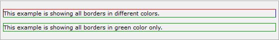
<p class="example1">
This example is showing all borders in different colors.
</p>
<p class="example2">
This example is showing all borders in green color only.
</p>
결과는 아래와 같습니다.
The border-style Property:
테두리 스타일을 내 마음대로 변경할 수 있습니다. 테두리 스타일의 종류로는 아래와 같은 것들이 있습니다.
none: No border. (Equivalent of border-width:0;)
solid: Border is a single solid line.
dotted: Border is a series of dots.
dashed: Border is a series of short lines.
double: Border is two solid lines.
groove: Border looks as though it is carved into the page.
ridge: Border looks the opposite of groove.
inset: Border makes the box look like it is embedded in the page.
outset: Border makes the box look like it is coming out of the canvas.
hidden: Same as none, except in terms of border-conflict resolution for table elements.
테두리 스타일 역시 방향에 따라 각기 다른 스타일을 설정할 수 있습니다. 아래 속성들을 이용해서 말이죠.
border-bottom-style
border-top-style
border-left-style
border-right-style
예제를 한번 보시죠.
<p style="border-width:4px; border-style:none;">
This is a border with none width.
</p>
<p style="border-width:4px; border-style:solid;">
This is a solid border.
</p>
<p style="border-width:4px; border-style:dashed;">
This is a dahsed border.
</p>
<p style="border-width:4px; border-style:double;">
This is a double border.
</p>
<p style="border-width:4px; border-style:groove;">
This is a groove border.
</p>
<p style="border-width:4px; border-style:ridge">
This is aridge  border.
</p>
<p style="border-width:4px; border-style:inset;">
This is a inset border.
</p>
<p style="border-width:4px; border-style:outset;">
This is a outset border.
</p>
<p style="border-width:4px; border-style:hidden;">
This is a hidden border.
</p>
<p style="border-width:4px;
             border-top-style:solid;
             border-bottom-style:dashed;
             border-left-style:groove;
             border-right-style:double;">
This is a a border with four different styles.
</p>
결과는 아래와 같습니다.
This is a border with none width.
This is a solid border.
This is a dahsed border.
This is a double border.
This is a groove border.
This is aridge border.
This is a inset border.
This is a outset border.
This is a hidden border.
This is a a border with four different styles.
The border-width Property:
테두리 두께를 내 마음대로 변경할 수 있게끔 해주는 속성입니다. 단위로는 px, pt, cm을 사용할 수도 있고, 정도에 따라 thin, medium, 또는 thick 값을 지정할 수도 있습니다.
이 속성 역시 방향에 따라 각각 부여 할 수 있습니다.
border-bottom-width
border-top-width
border-left-width
border-right-width
다음 예제를 한번 보시죠.
<p style="border-width:4px; border-style:solid;">
This is a solid border whose width is 4px.
</p>
<p style="border-width:4pt; border-style:solid;">
This is a solid border whose width is 4pt.
</p>
<p style="border-width:thin; border-style:solid;">
This is a solid border whose width is thin.
</p>
<p style="border-width:medium; border-style:solid;">
This is a solid border whose width is medium;
</p>
<p style="border-width:thick; border-style:solid;">
This is a solid border whose width is thick.
</p>
<p style="border-bottom-width:4px;
             border-top-width:10px;
             border-left-width: 2px;
             border-right-width:15px;
             border-style:solid;">
This is a a border with four different width.
</p>
결과는 아래와 같습니다.
This is a solid border whose width is 4px.
This is a solid border whose width is 4pt.
This is a solid border whose width is thin.
This is a solid border whose width is medium;
This is a solid border whose width is thick.
This is a a border with four different width.
Border Properties Using Shorthand:
지금까지 테두리의 색상, 스타일, 그리고 두께에 대해서 속성값을 변경하는 법을 배워보았습니다.
그런데 하나하나 지정해주려니 좀 귀찮은 감이 없지않아 있네요.
그래서 여기 type less do more를 실천하고있는 방법을 하나 소개해 드리려고 합니다.
다음 예제를 한번 보실까요??
<p style="border:4px solid red;">
This example is showing shorthand property for border.
</p>
결과는 아래와 같습니다.
This example is showing shorthand property for border.
이번 포스팅에서는 CSS를 이용한 테이블 관련 속성을 설정하는 것을 알아보도록 하겠습니다.
테이블 관련 속성에는 다음과 같은 것들이 있습니다.
border-collapse
border-spacing
caption-side
empty-cells
table-layout
이제 이 속성들을 어떻게 사용하는지 한번 볼까요??? ^-^
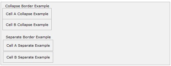
The border-collapse Property:
이 속성은 다음 두가지 값을 가질 수 있습니다. collapse 와 separate.
다음은 두 가지 값에 대한 예제입니다.
<style type="text/css">
table.one {border-collapse:collapse;}
table.two {border-collapse:separate;}
td.a {
      border-style:dotted;
      border-width:3px;
      border-color:#000000;
      padding: 10px;
}
td.b {border-style:solid;
      border-width:3px;
      border-color:#333333;
      padding:10px;
}
</style>
<table class="one">
<caption>Collapse Border Example</caption>
<tr><td class="a"> Cell A Collapse Example</td></tr>
<tr><td class="b"> Cell B Collapse Example</td></tr>
</table>
<br />
<table class="two">
<caption>Separate Border Example</caption>
<tr><td class="a"> Cell A Separate Example</td></tr>
<tr><td class="b"> Cell B Separate Example</td></tr>
</table>
직접 테스트 해보세요.
Collapse 속성값을 주게되면 테이블 내의 셀들의 보더가 붙어있을 경우 한줄로 보이게 됩니다.
반대로 separate속성값을 주게되면 붙어있는 두 셀의 보더가 따로 떨어져서 보이게 됩니다.
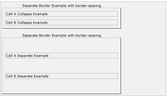
The border-spacing Property:
이 속성은 보더 사이의 간격을 띄우는 속성입니다. 속성값으로는 하나 또는 두개의 값을 가질 수 있고, 이 값은 길이의 단위여야 합니다.
값을 하나만 줄 경우에는 가로, 세로에 동일한 값이 적용이 되며 두개의 값을 줄 경우에는 첫째값이 가로 스페이스, 두번째 값이 세로 스페이스를 위한 값으로 간주됩니다.
NOTE: Netscape 7 또는 IE 6 에서는 적용되지 않는다고 하네요. 아직도 IE 6 사용하는 사람이 있을지는 의문이지만요.
<style type="text/css">
/* If you provide one value */
table.example {border-spacing:10px;}
/* This is how you can provide two values */
table.example {border-spacing:10px; 15px;}
</style>
앞서 했던 예제의 소스를 변경해보도록 하겠습니다.
<style type="text/css">
table.one {
   border-collapse:separate;
   width:400px;
   border-spacing:10px;
}
table.two {
   border-collapse:separate;
   width:400px;
   border-spacing:10px 50px;
}
</style>
<table class="one" border="1">
<caption>Separate Border Example with border-spacing</caption>
<tr><td> Cell A Collapse Example</td></tr>
<tr><td> Cell B Collapse Example</td></tr>
</table>
<br />
<table class="two" border="1">
<caption>Separate Border Example with border-spacing</caption>
<tr><td> Cell A Separate Example</td></tr>
<tr><td> Cell B Separate Example</td></tr>
</table>
결과는 아래와 같습니다.
직접 테스트 해보는 것 잊지 마세요. 꼭 이요!!! ^-^
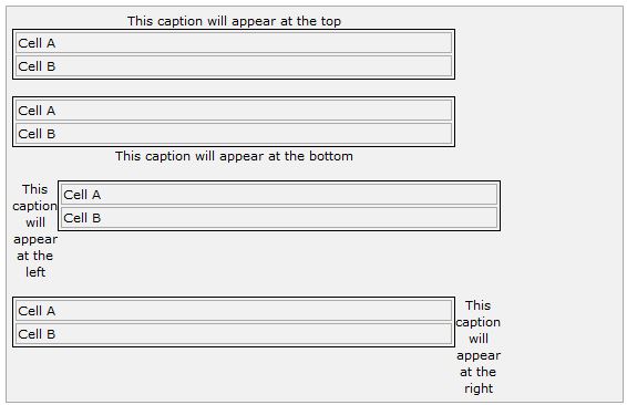
The caption-side Property:
이 속성은 캡션을 어디에 위치시킬 것인지에 대한 속성입니다.속성값으로는 다음 네가지 중 한개를 가질 수 있습니다. top, bottom, left or right. 그럼 각각의 예제를 한번 볼까요??
NOTE: IE 에서는 작동을 안할 수 있다는 군요.
<style type="text/css">
caption.top {caption-side:top}
caption.bottom {caption-side:bottom}
caption.left {caption-side:left}
caption.right {caption-side:right}
</style>

<table style="width:400px; border:1px solid black;">
<caption class="top">
This caption will appear at the top
</caption>
<tr><td > Cell A</td></tr>
<tr><td > Cell B</td></tr>
</table>
<br />

<table style="width:400px; border:1px solid black;">
<caption class="bottom">
This caption will appear at the bottom
</caption>
<tr><td > Cell A</td></tr>
<tr><td > Cell B</td></tr>
</table>
<br />

<table style="width:400px; border:1px solid black;">
<caption class="left">
This caption will appear at the left
</caption>
<tr><td > Cell A</td></tr>
<tr><td > Cell B</td></tr>
</table>
<br />

<table style="width:400px; border:1px solid black;">
<caption class="right">
This caption will appear at the right
</caption>
<tr><td > Cell A</td></tr>
<tr><td > Cell B</td></tr>
</table>
결과는 아래와 같습니다.
The empty-cells Property:
이 속성은 빈 셀과 관련된 속성입니다. 속성값으로는 show, hide, inherit 중에 하나를 가질 수 있습니다.
Following is the example which demonstrates how to change the color of links when we bring a mouse pointer over that link. Possible value could be any color name in any valid format.


